Case study on offering courses and subscriptions in the legal area and public competitions
- CompanyCERS
- RoleLead Product Designer
- Duration3 months
- Responsibilities
- End-to-end management (discovery and delivery)
- Market analysis
- User research
- User mapping
- User flows
- Prototyping
- Usability testing
Online legal education and preparation for public exams are growing with the demand for qualification and stability. In this scenario, digital platforms become essential to provide quick access, quality content, and efficient learning.
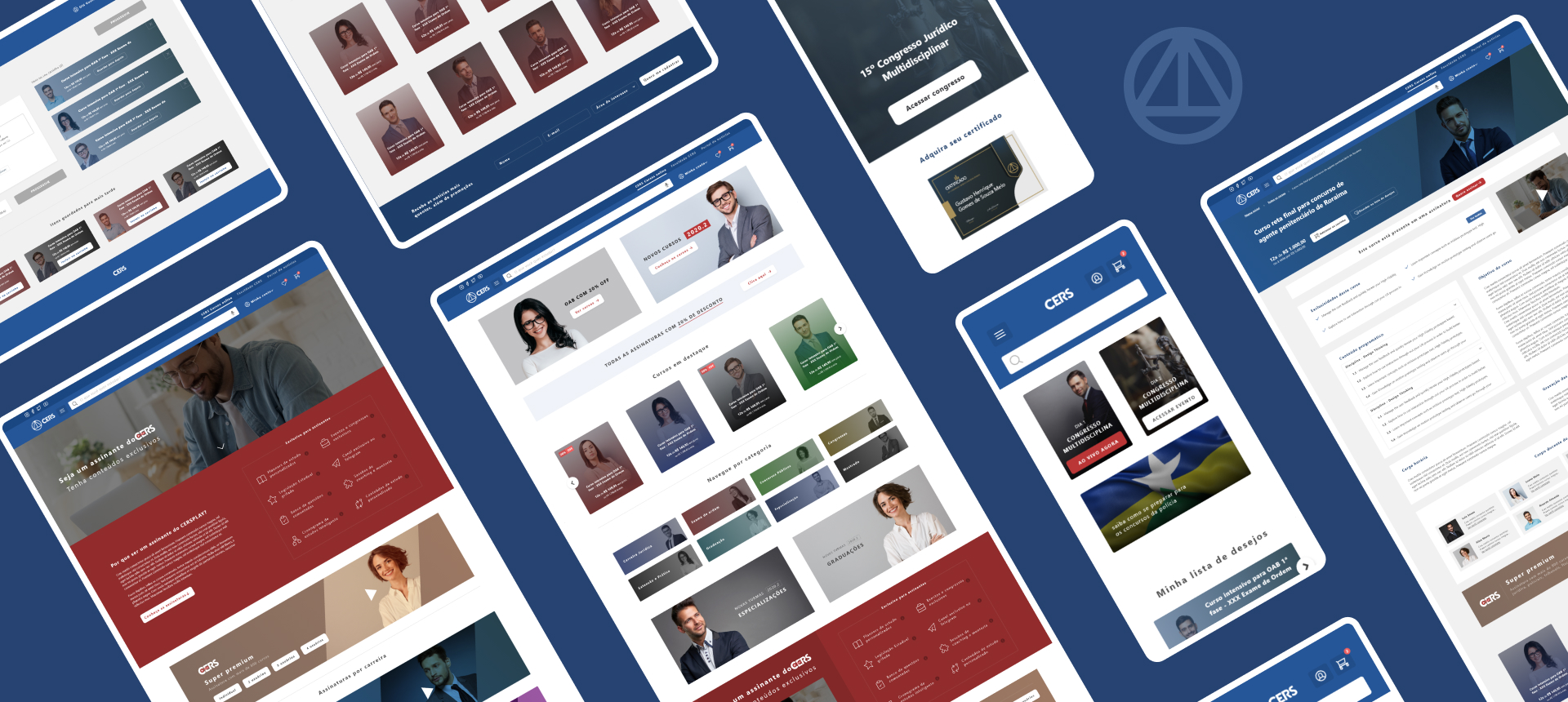
E-commerce web focused on selling courses and subscriptions in the legal area and public competitions, promoting events and faculty. Solution planned after research and evaluation of operational costs in selling products on Google Play and App Store.
Understanding the problem
The context
In the legal education and public exam market, offering content is no longer enough. The difference lies in promoting experiences that engage, motivate, and place the student at the center of learning, combining quality, accessibility, and continuous connection with their goals.
The scenario
The pandemic accelerated the adoption of distance learning in Brazil, making it an emergency solution for the continuity of classes. Institutions at all levels quickly migrated to digital platforms, boosting the growth of the distance education market. However, this movement revealed challenges such as inequality in internet access, lack of teacher preparation for remote teaching, and difficulties in student engagement. Despite the limitations, the scenario paved the way for the strengthening of online education, which began to be seen as a strategic and necessary alternative for the future of education.
Heuristic evaluation
Heuristic evaluation was used to identify usability problems on the current CERS website, which offers courses and subscriptions in the legal area and public competitions. The evaluation was carried out based on usability principles.
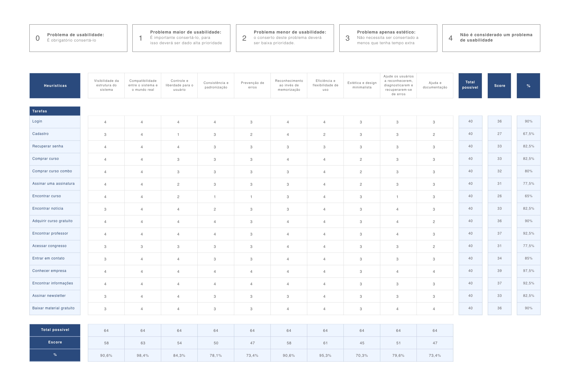
Analyzing results
The following usability problems were identified on the current CERS website:
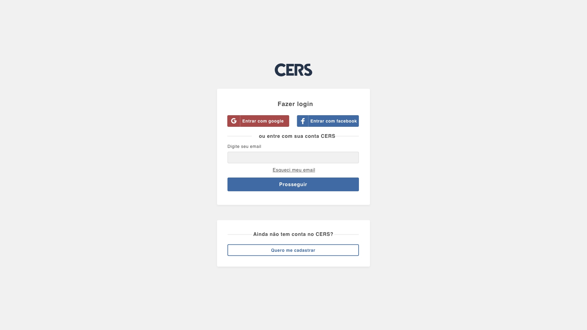
- Registration without login option for existing users;
- Login without its own page, being an important point for correction;
- Course page being used for paid, free courses and congresses;
- Product exclusivities not being clearly displayed;
- Product names in CAPSLOCK and too many characters;
- Congress certificates being sold as courses;
- Cart in steps, without social login and without the option to save items for later;
- Inefficient search for products, teachers, and content.
CSD Matrix
In structuring the Matrix, consideration was given to which methods/research would be used later so that assumptions and doubts could be validated.
- Bring a broader search based on tags (and not just the product name), making it easier for the product to be found on the site (course, subscription, congress, and teacher).;
- Changing the site color to match the campaign mischaracterizes the site (except for very relevant campaigns, such as Black Friday).;
- Description of each feature/functionality offered for subscriptions will facilitate student understanding.
- Thumbnails with too much information confuse students.
- Very long course names confuse students.
- The icons in the course listing 'boxes' do not add value for those considering purchasing the product.
- Do the colors of the main categories really make a difference in finding a product?
- Show the discount value as a percentage or as an amount?
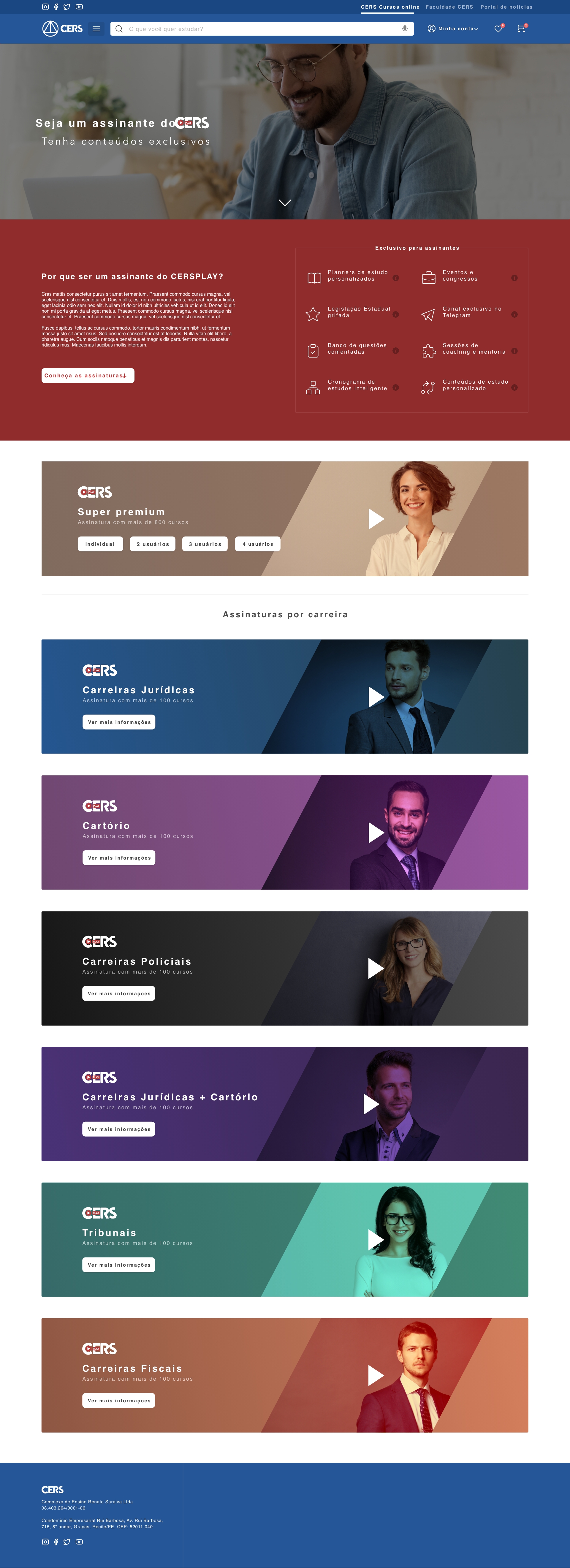
- Are the subscriptions being displayed in the best way?
- Show news on the home page?
- On the product page, does it make sense to bring click to call before the product information?
- Show 'Become our partner' on the home page?
- Which features/functionality are exclusive to subscriptions?
- Does a banner on the course page make the user more interested in the product?
- On the home page, are 'new releases' and 'most wanted' the best filters to be displayed to students?
Competitive benchmarking
The following competitor/reference sites were analyzed:
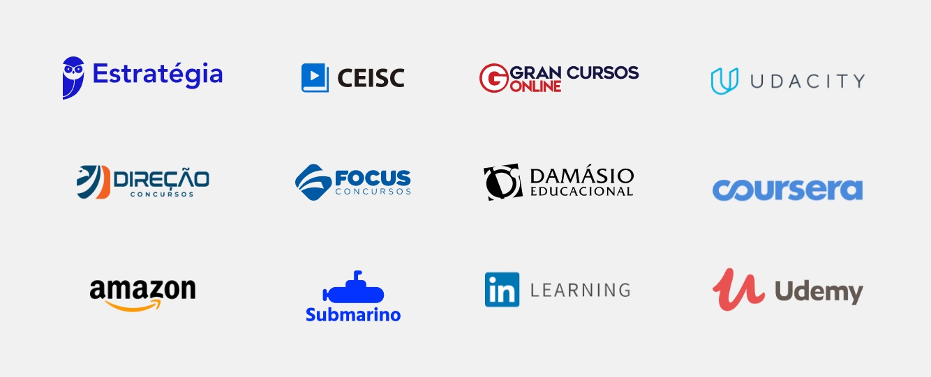
The following insights were identified:
- Bring a mental model so that the user can easily identify the relationship of a product with a category/career.
- Create a well-defined visual standard for all site elements, thus bringing more consistency to the interface.
- Monitor the interests and needs of students, aiming to offer relevant content through a wish list.
- Improve the experience and clarity regarding the different types of products: courses, subscriptions, certificates, and congresses.
- Facilitate login and registration with two-step verification and fewer required fields.
- Restructure the display of content and products, offering a clean and intuitive experience.
Quantitative and qualitative research
Analyzing the current platform, the following data were collected:
- Use computer to access the current platform to purchase a product
- 49,67%
- Use mobile to access the current platform to consult a product
- 49,19%
- People are students who use Portuguese as their main language
- 96,14%
- People are female
- 55,9%
- People are male
- 44,1%
- People are between 18 and 34 years old
- 60,2%
Analyzing results
The impact on society
The pandemic strongly impacted the public exam and legal course sector. Several exams were suspended or postponed, generating uncertainties and reducing the immediate supply of vacancies. On the other hand, this pause increased the demand for online preparation, boosting legal courses in distance learning format. Many candidates took advantage of the period to intensify their studies, and educational institutions had to adapt quickly, migrating to digital platforms and expanding their reach in remote teaching.
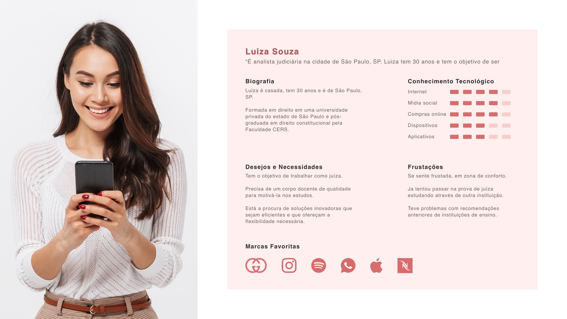
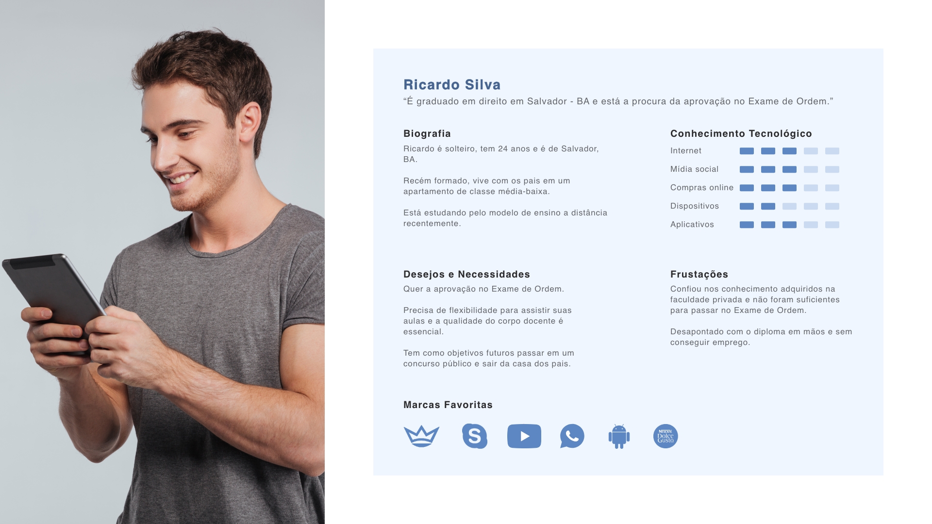
Mapping users
Analyzing the collected data, two personas were structured that represent the users of the CERS platform. These personas were developed based on real user profiles, allowing a deeper understanding of user needs and behaviors:
Idealizing the solution
Brainstorming
Several ideas were raised, with the following ideas selected for the initial version of the solution:

After all the analyses and raising all possibilities, it was possible to identify that the solution should be a responsive web platform. Creating an app in the initial version would not be viable due to the cost of fees for selling products in mobile stores (Apple and Google), in addition to most users using the computer to access the platform.
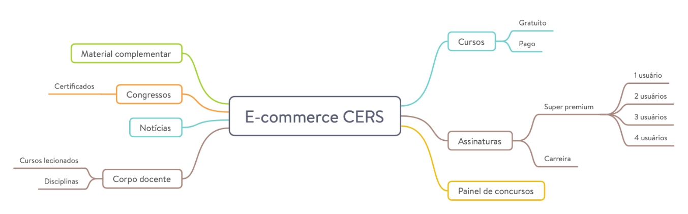
Mind map
The practice was used to organize the solution structure in a faster and more efficient way:
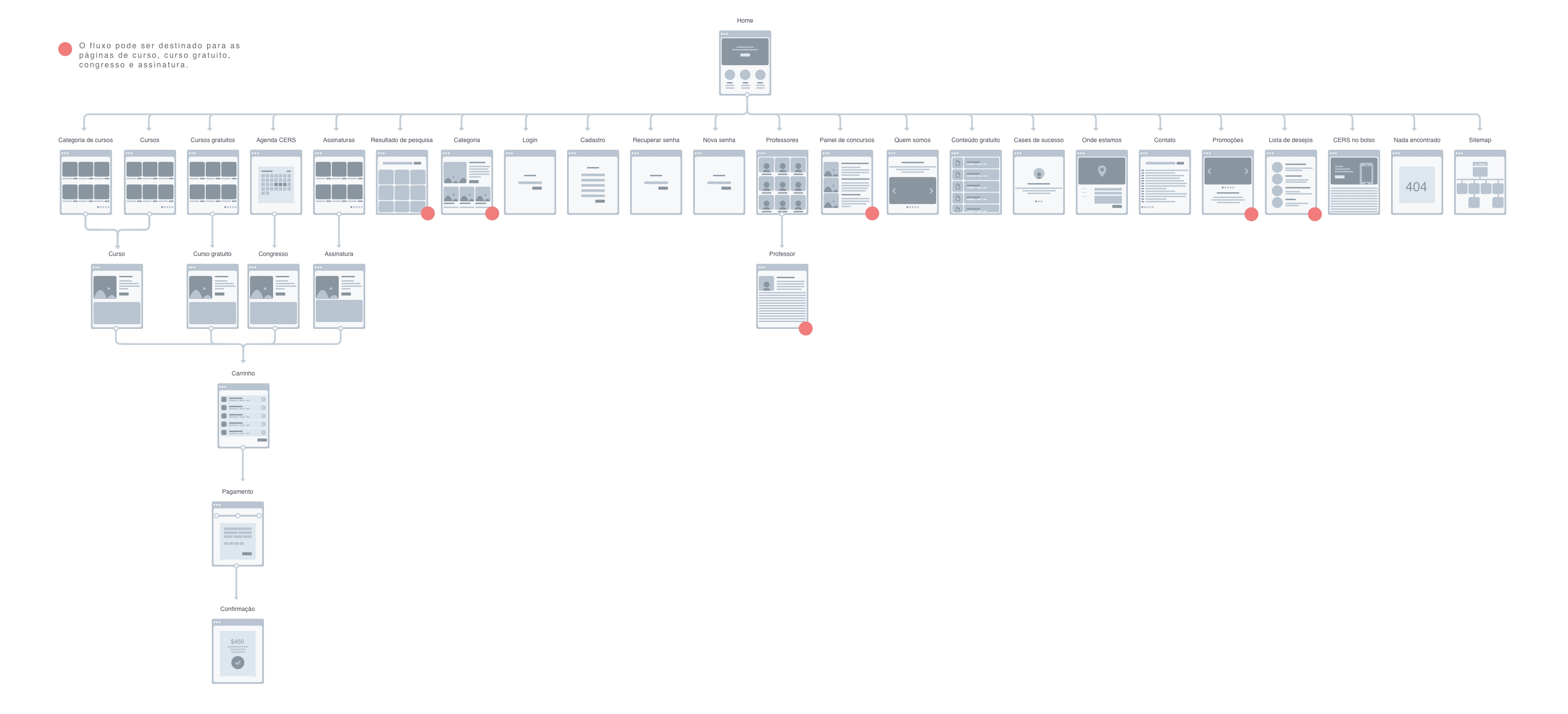
User flow
Before structuring the new flow, the current site flow was mapped:
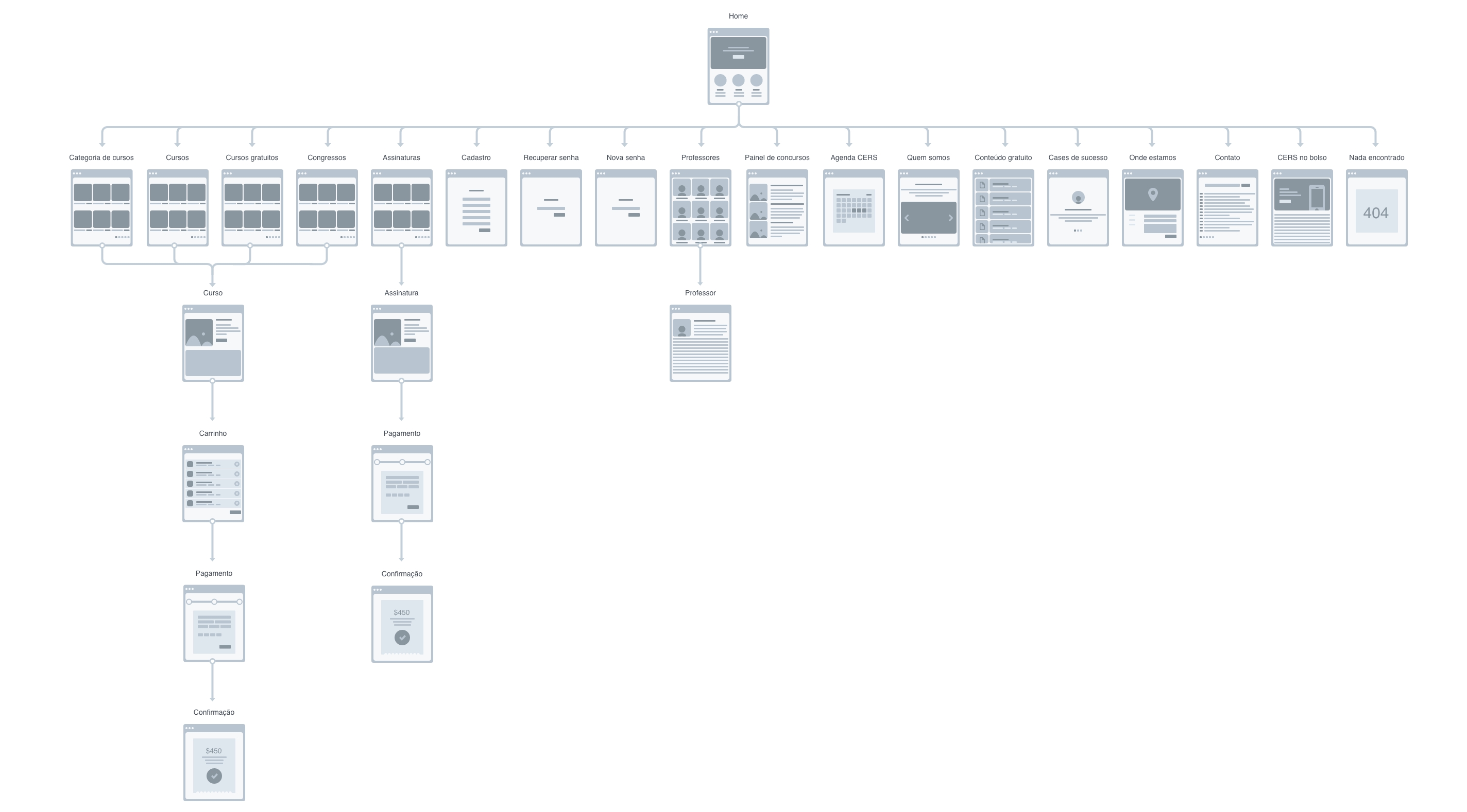
After the mapping and organization created in the Mind map, at this stage the new user navigation flow was created:
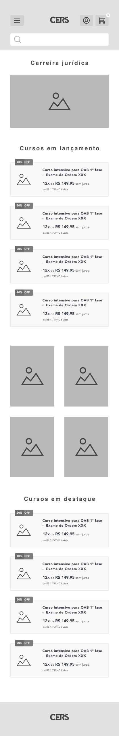
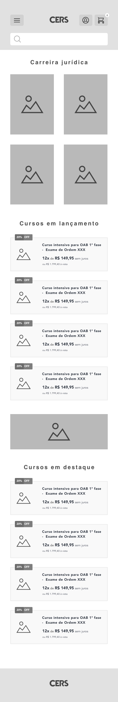
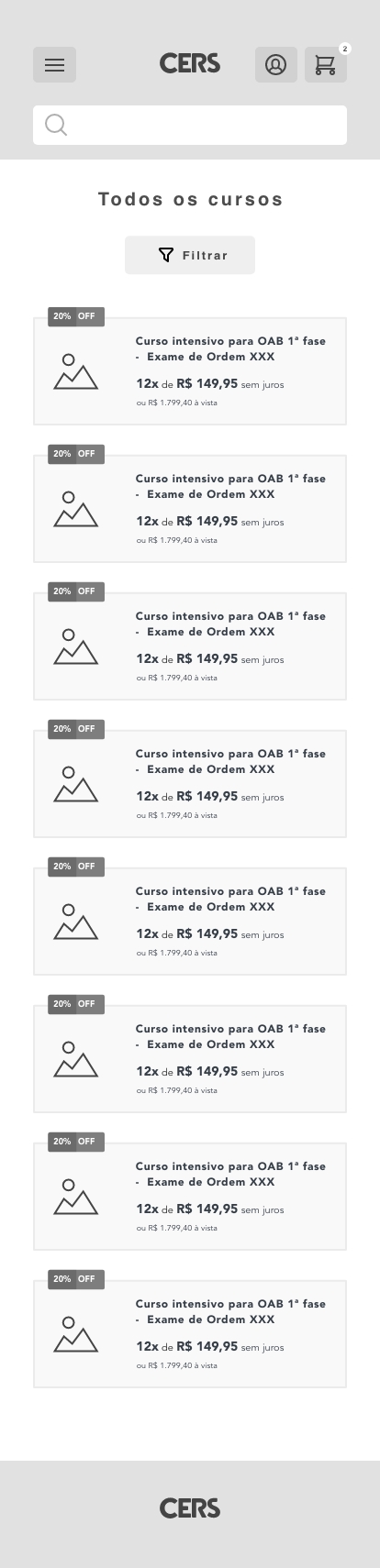
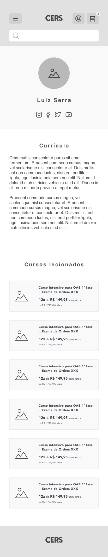
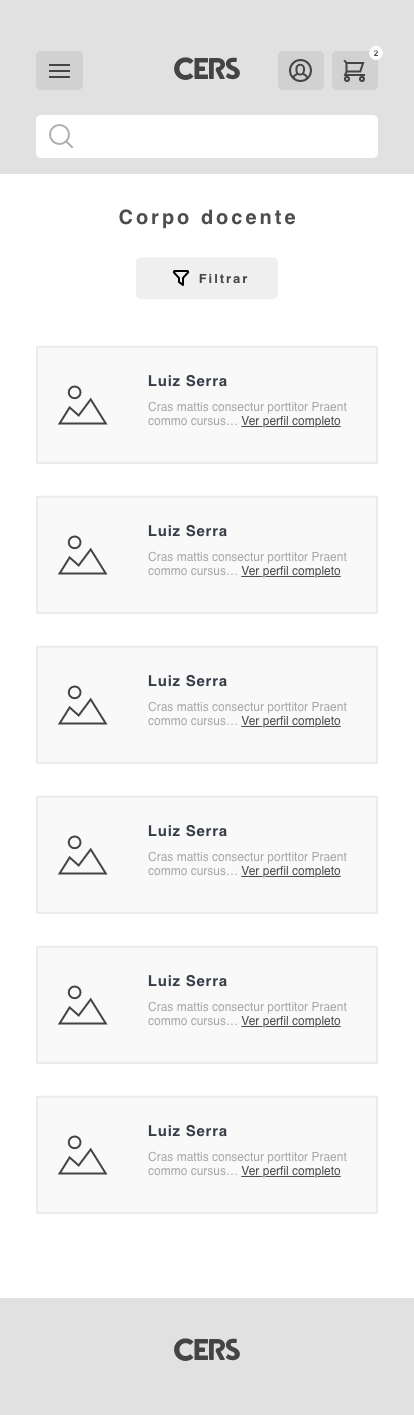
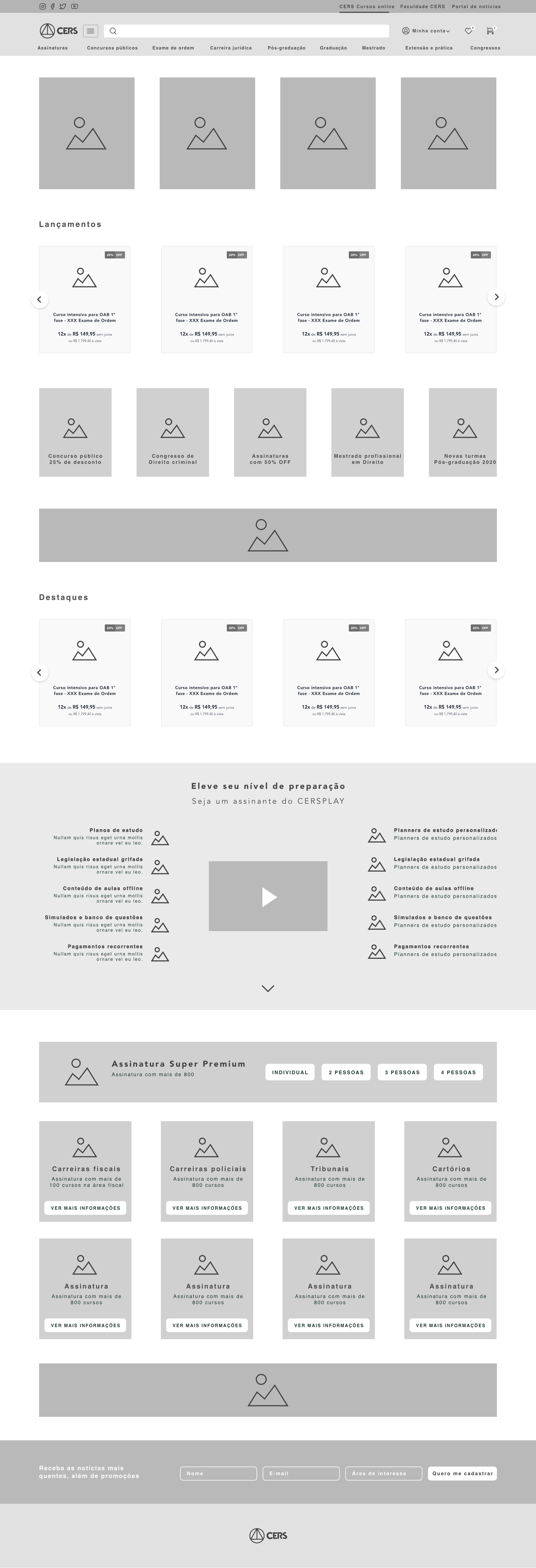
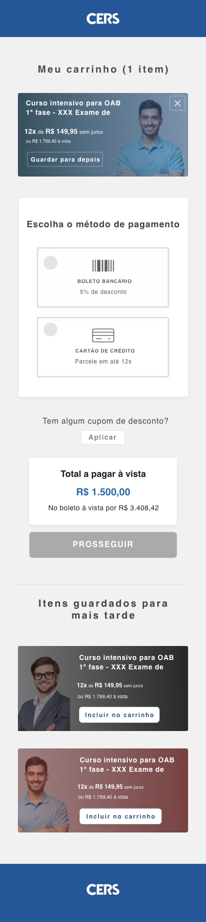
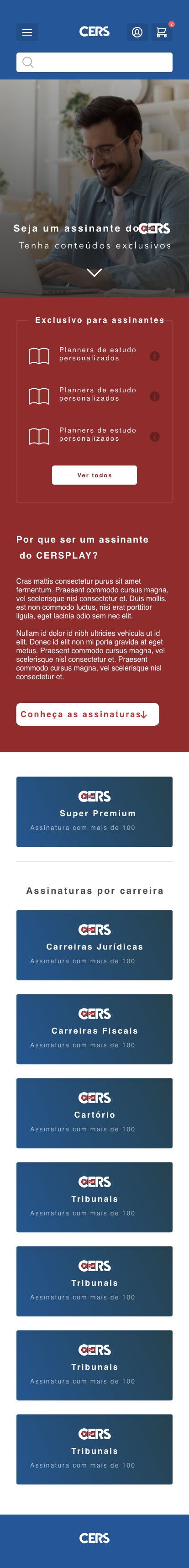
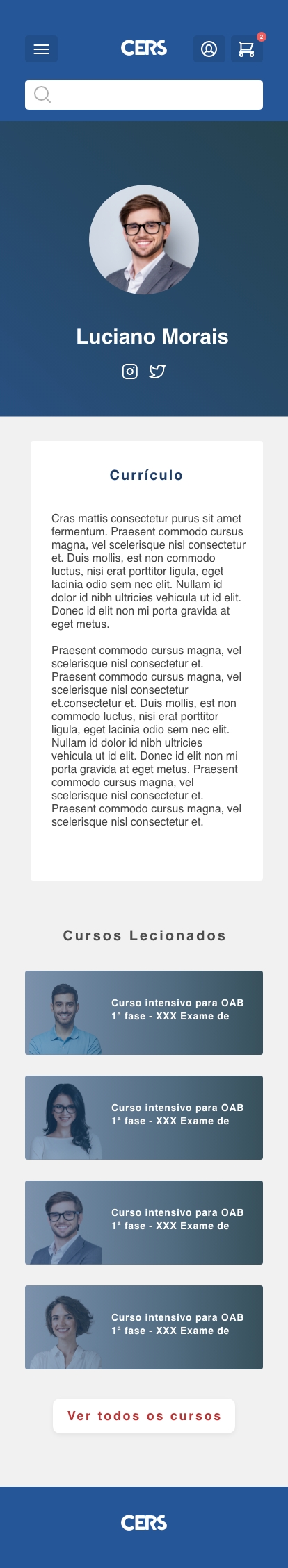
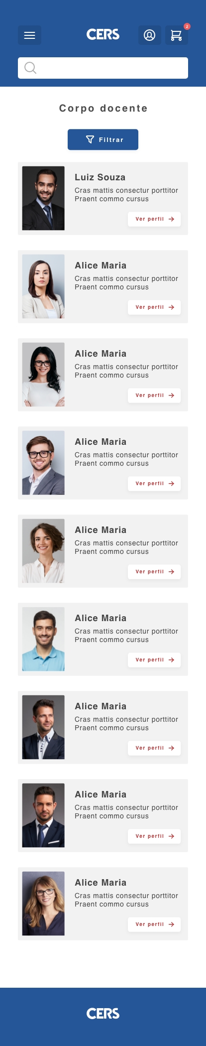
Low fidelity prototype
With the flow defined, the prototyping stage was started. At this first moment, low fidelity screens were created, allowing quick validation of initial ideas and adjustment of the concept before moving on to more detailed versions.
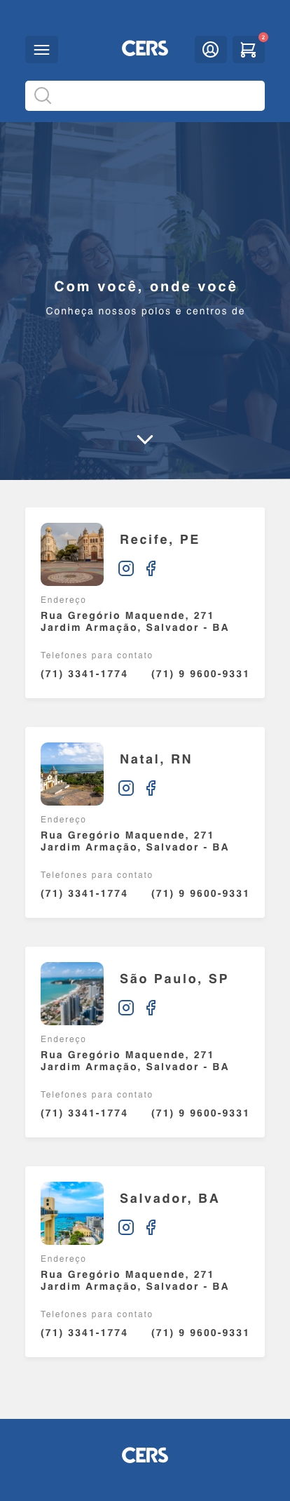
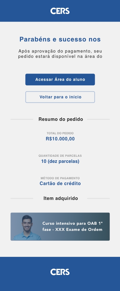
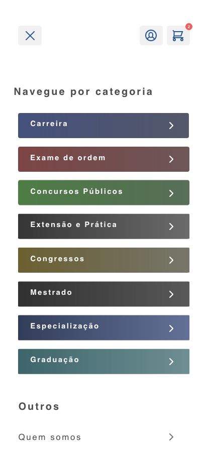
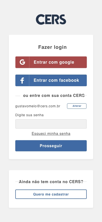
Mobile:

Desktop:
Usability tests
Some usability tests were carried out on the low fidelity prototype, from which some flow and writing errors were observed. Subsequently corrected in the high fidelity prototype.
Test planning:
- Definition of activities to be tested;
- Recruitment of users who resembled the personas;
- Creation of the script detailing what would be the 'success' of the selected activities for testing.
- Recruitment of users who resembled the personas;
- Creation of the script detailing what would be the 'success' of the selected activities for testing.
Metrics analyzed in the tests:
- Completion rate;
- Complexity rate;
- Execution time
The activities selected for testing were:
- 1 - Buy a course
- 2 - Purchase a subscription
- 3 - Register for a congress
- 4 - Purchase a congress certificate
- 5 - Access a live broadcast
- 6 - Find a teacher
Test feedback:
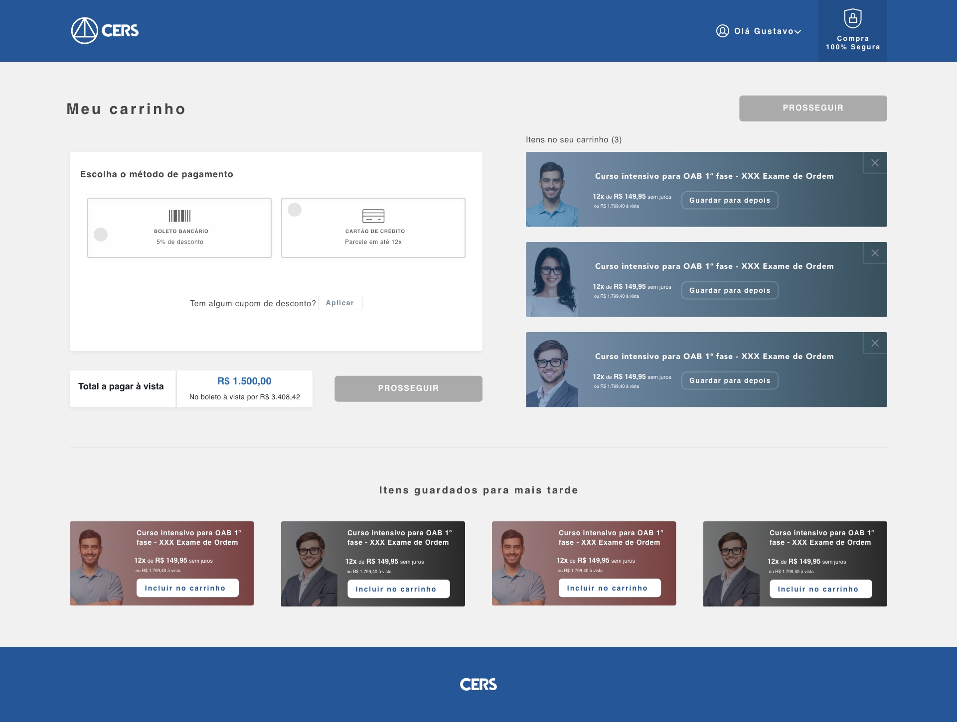
- Breadcrumb in the cart;
- Show subscriptions in the search result;
- Purchase certificate through the congress page;
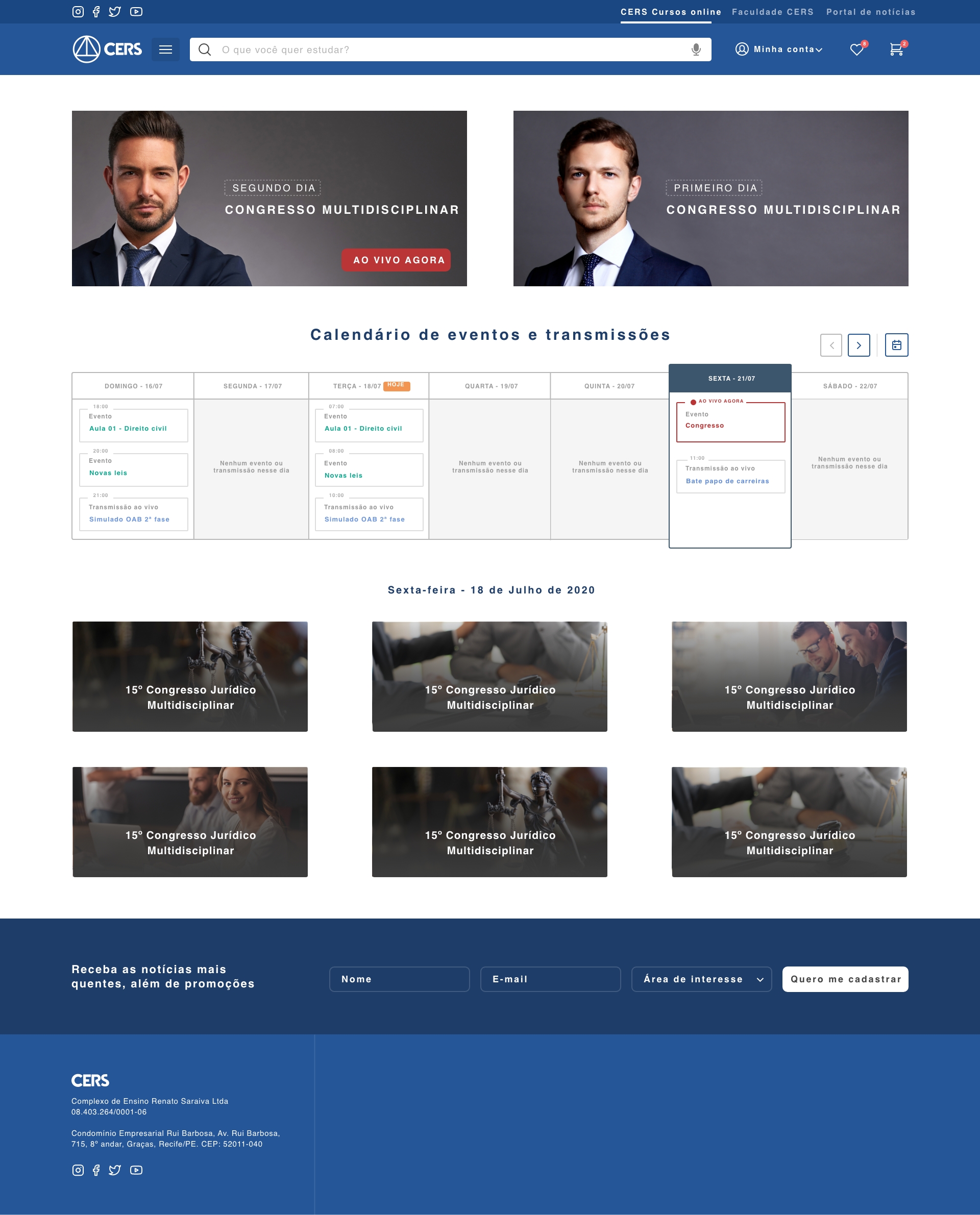
- Greater highlight for a live broadcast that is happening at the moment;
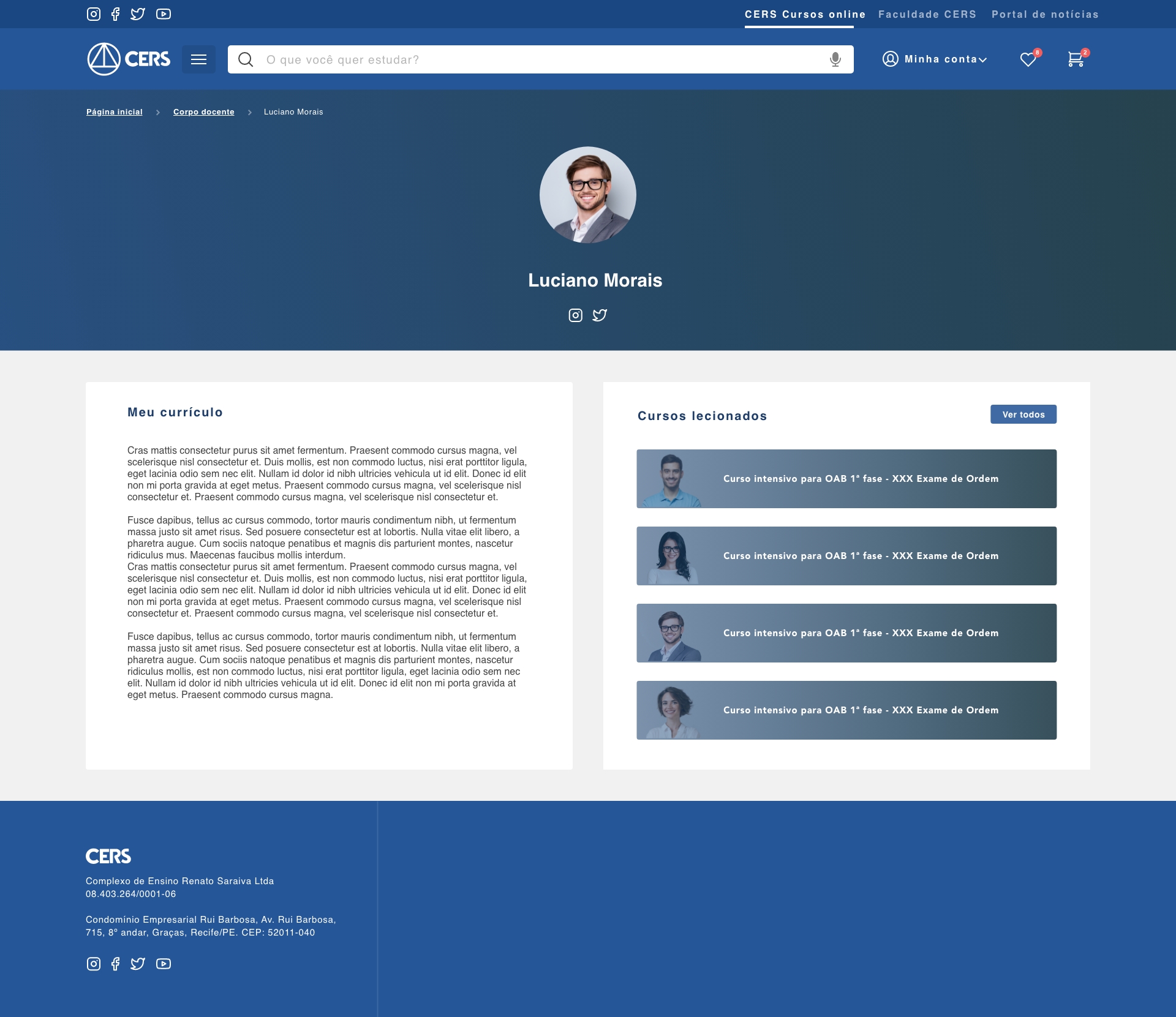
- Search on the teacher page;
- Display subcategories on the all courses page;
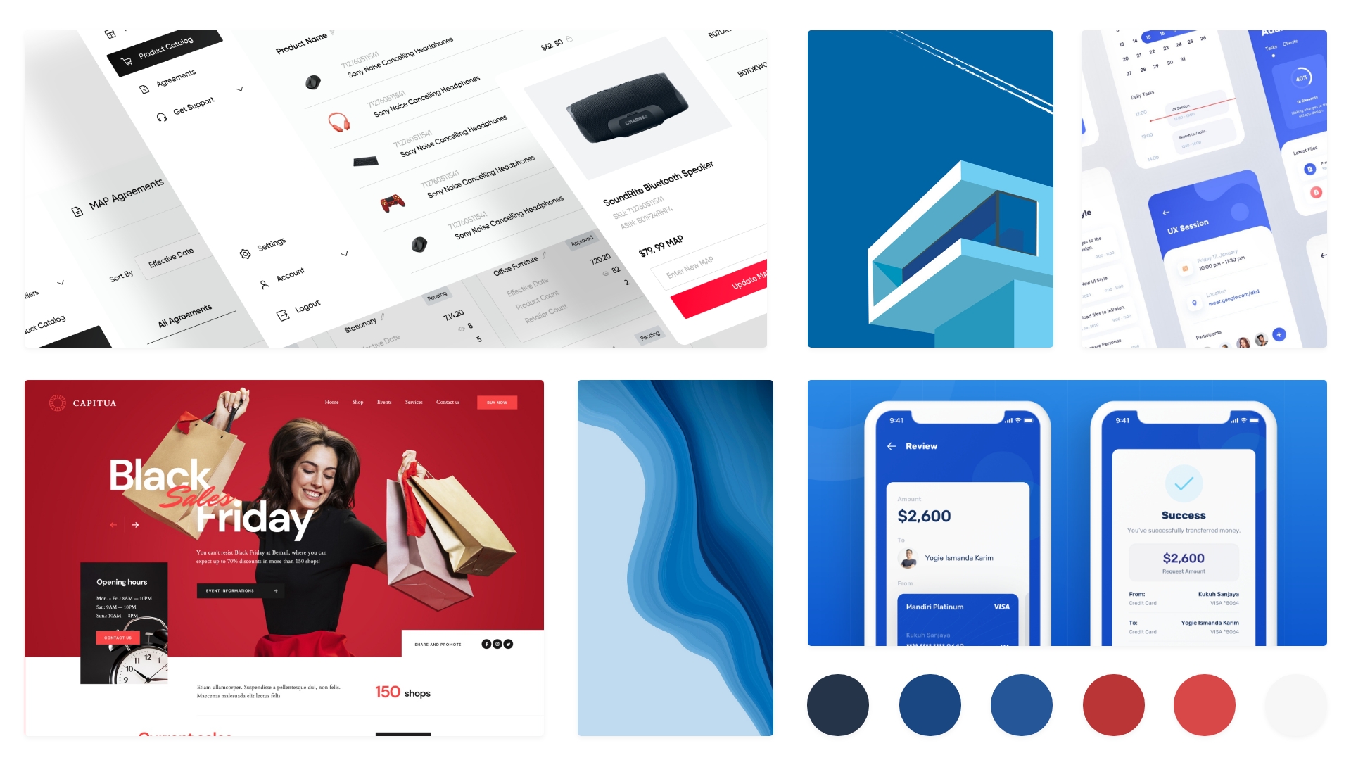
Moodboard
To contextualize the entire visual identity of the solution, a moodboard was created to be followed as an aesthetic/visual model for creating the styleguide.
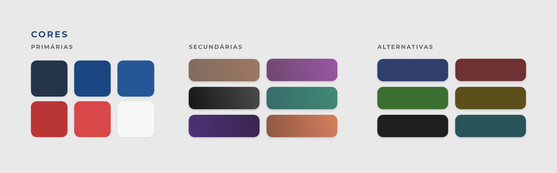
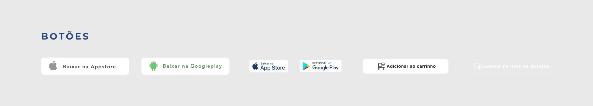
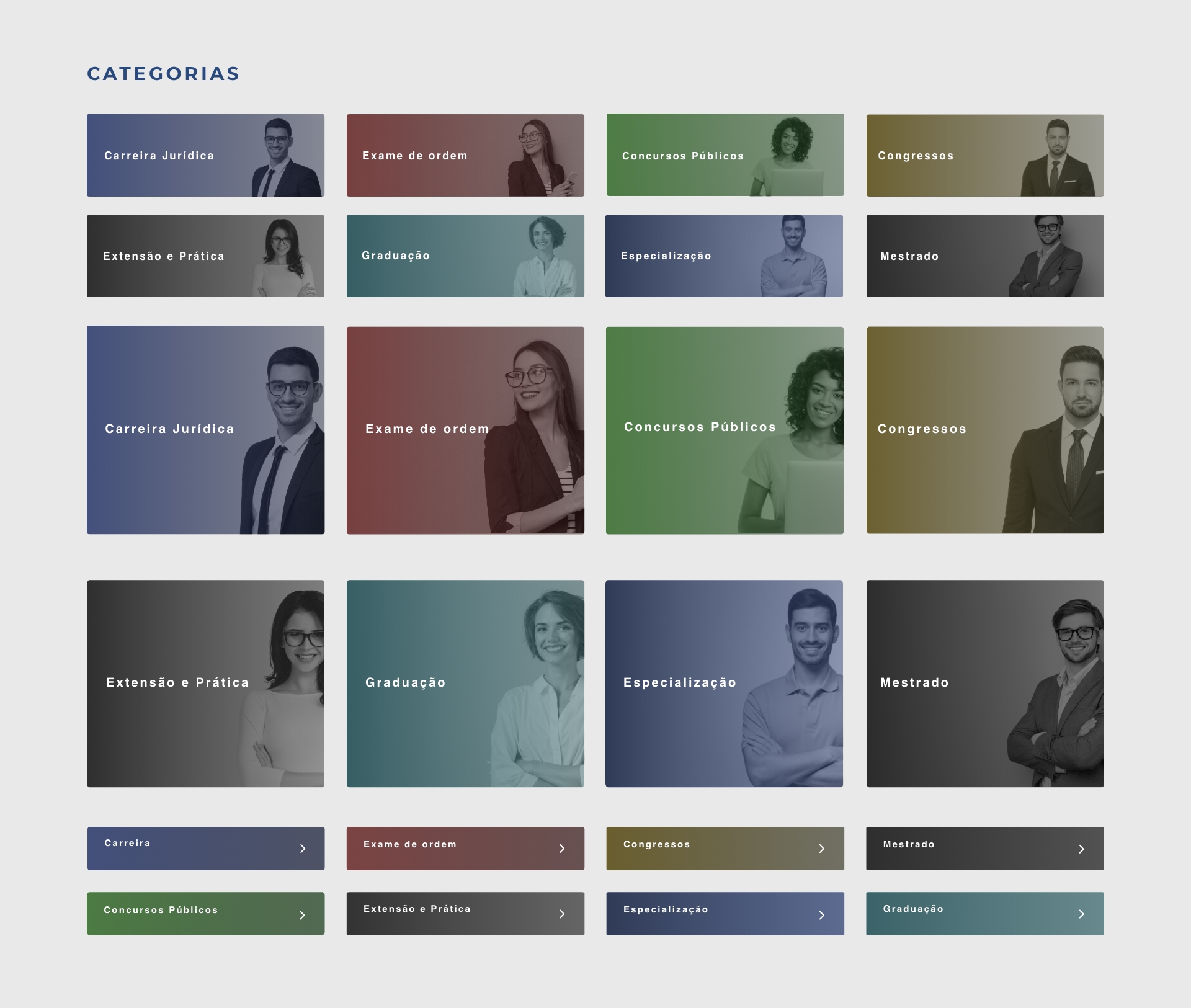
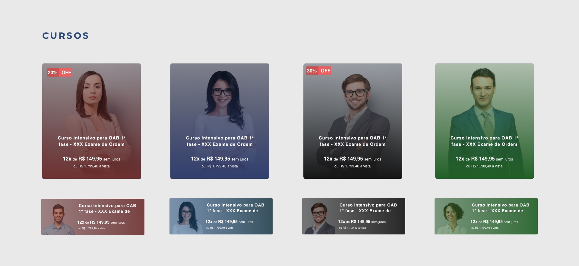
Styleguide
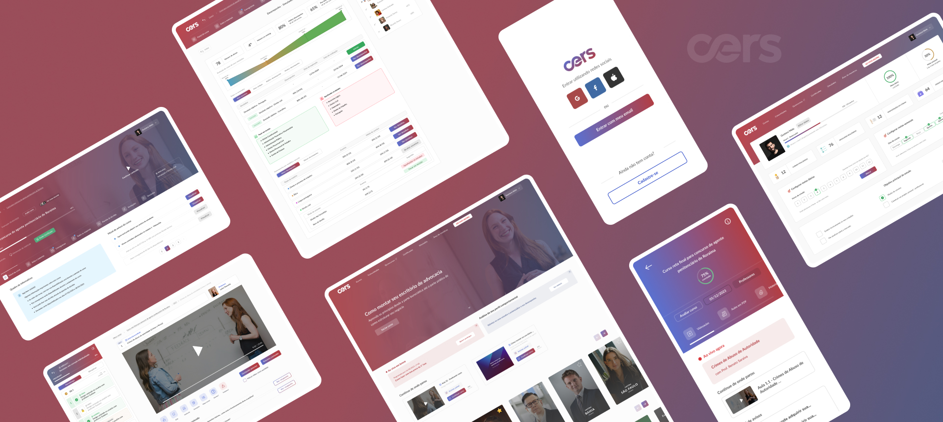
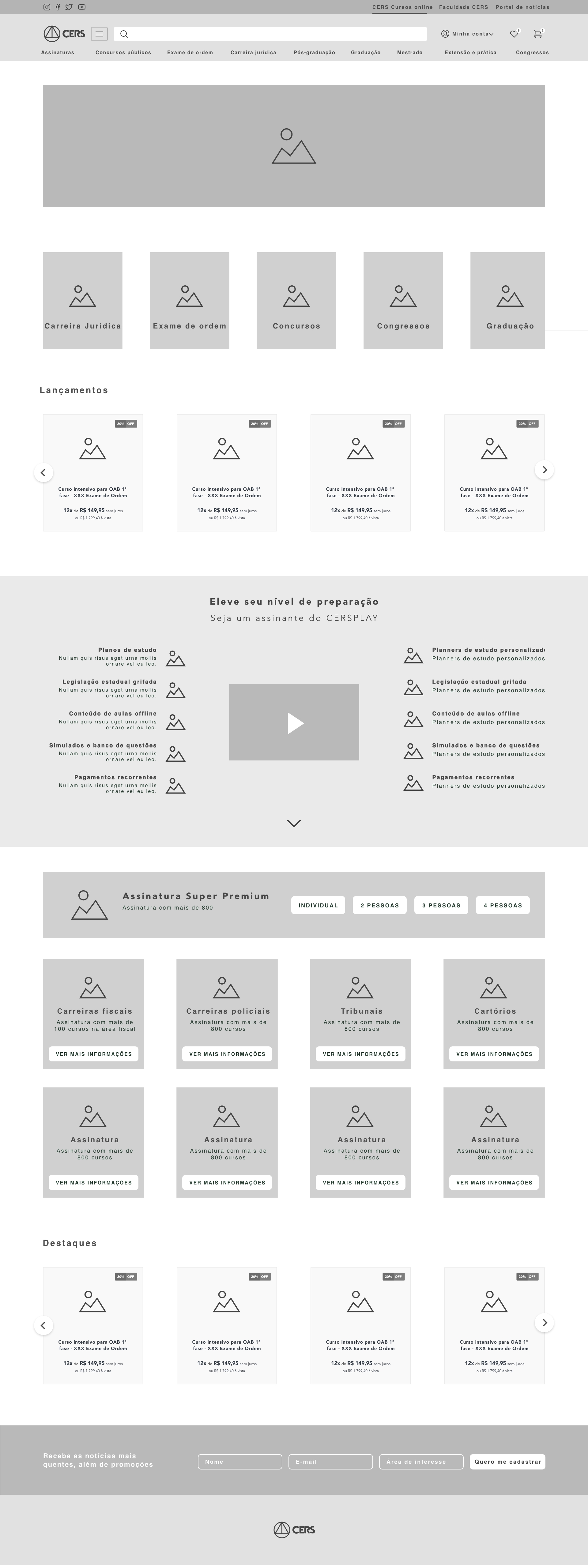
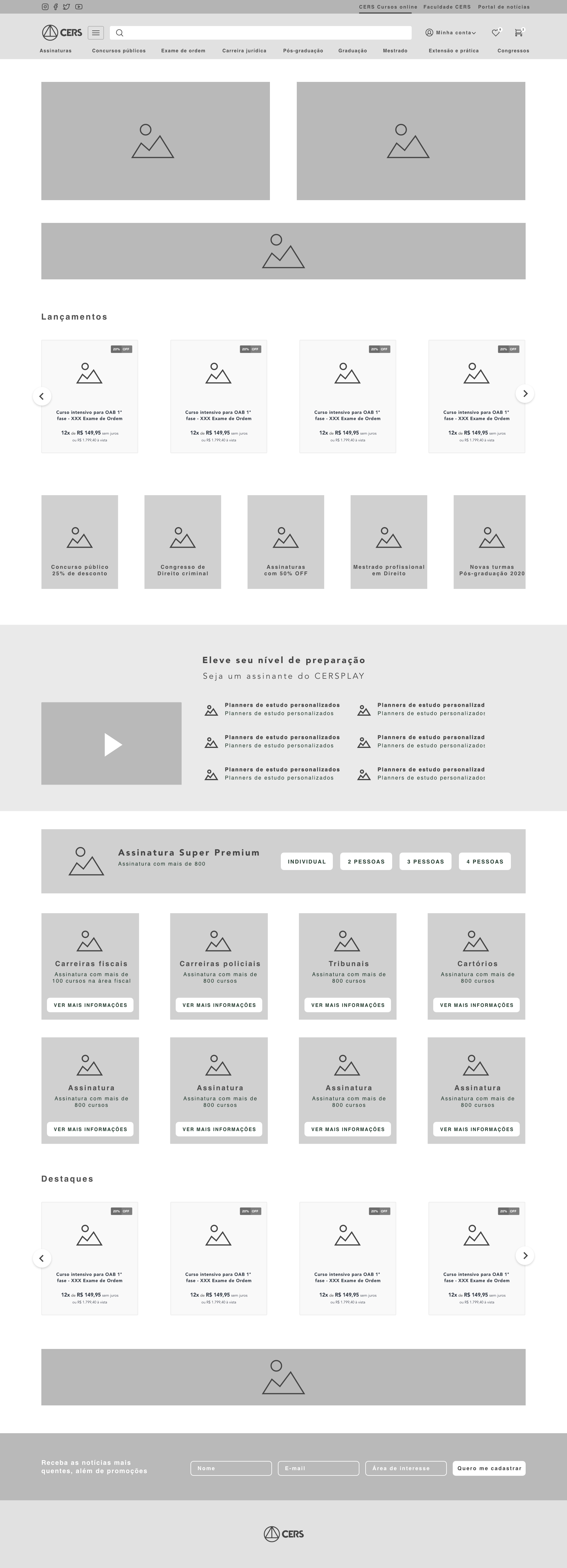
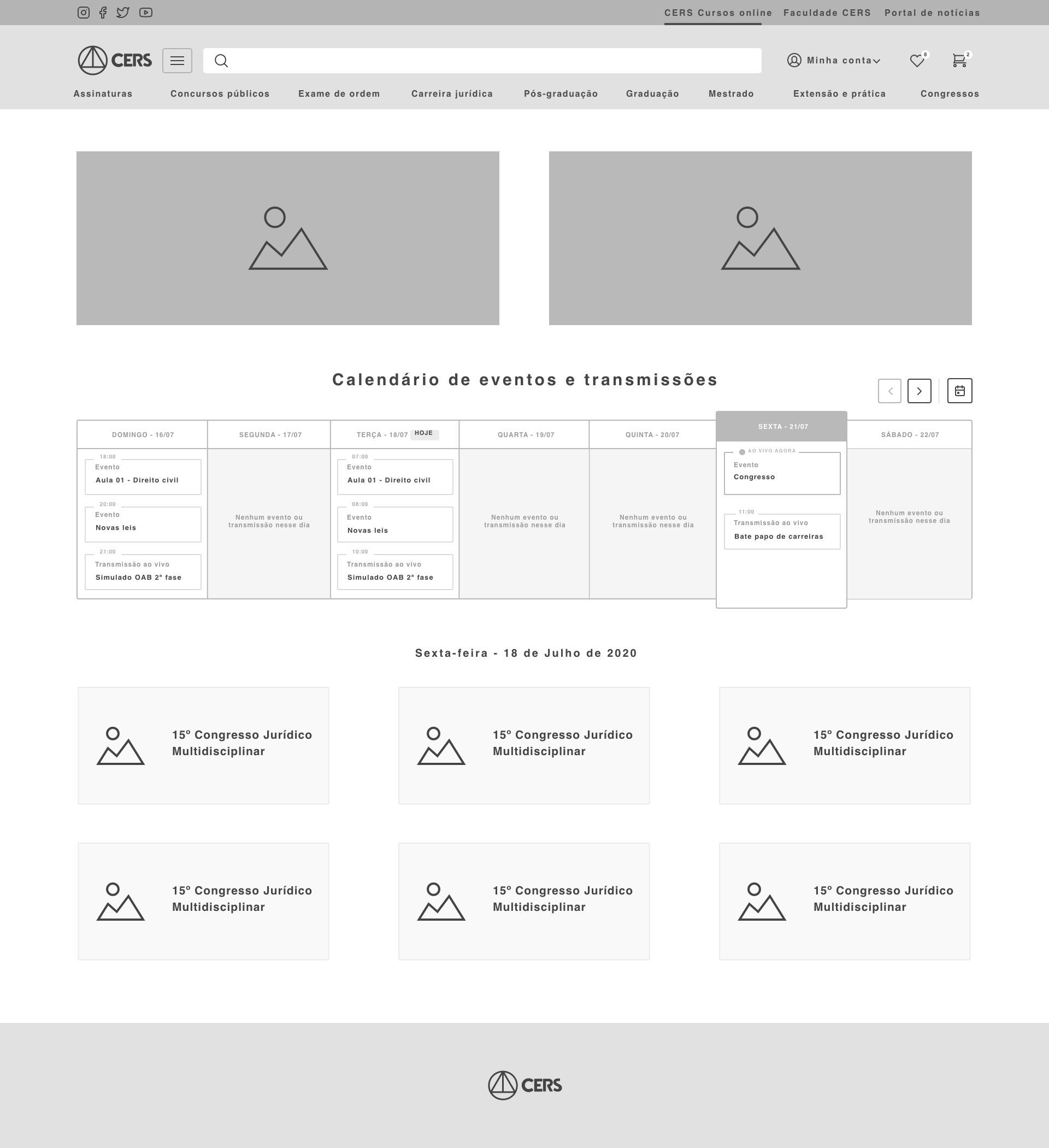
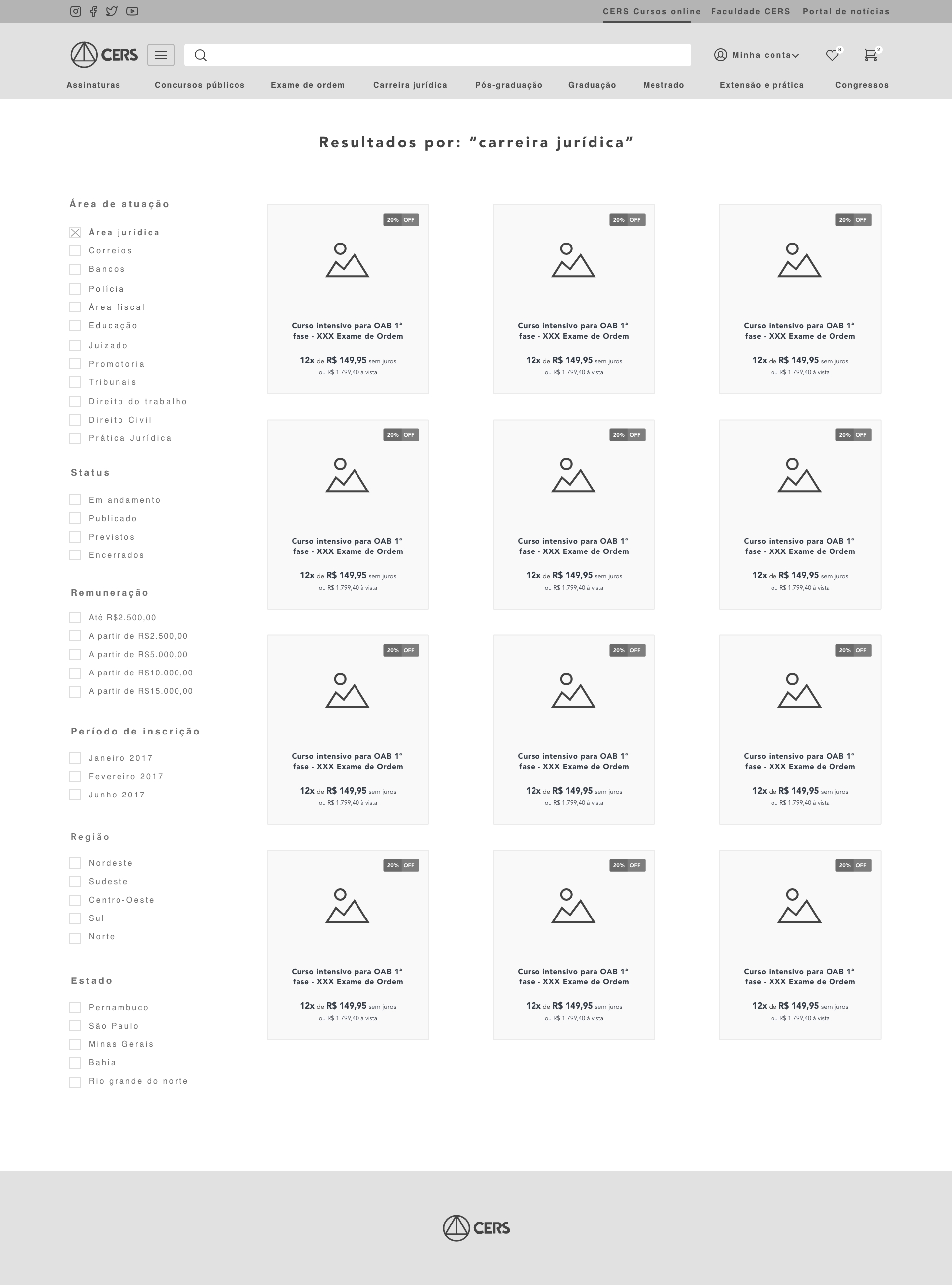
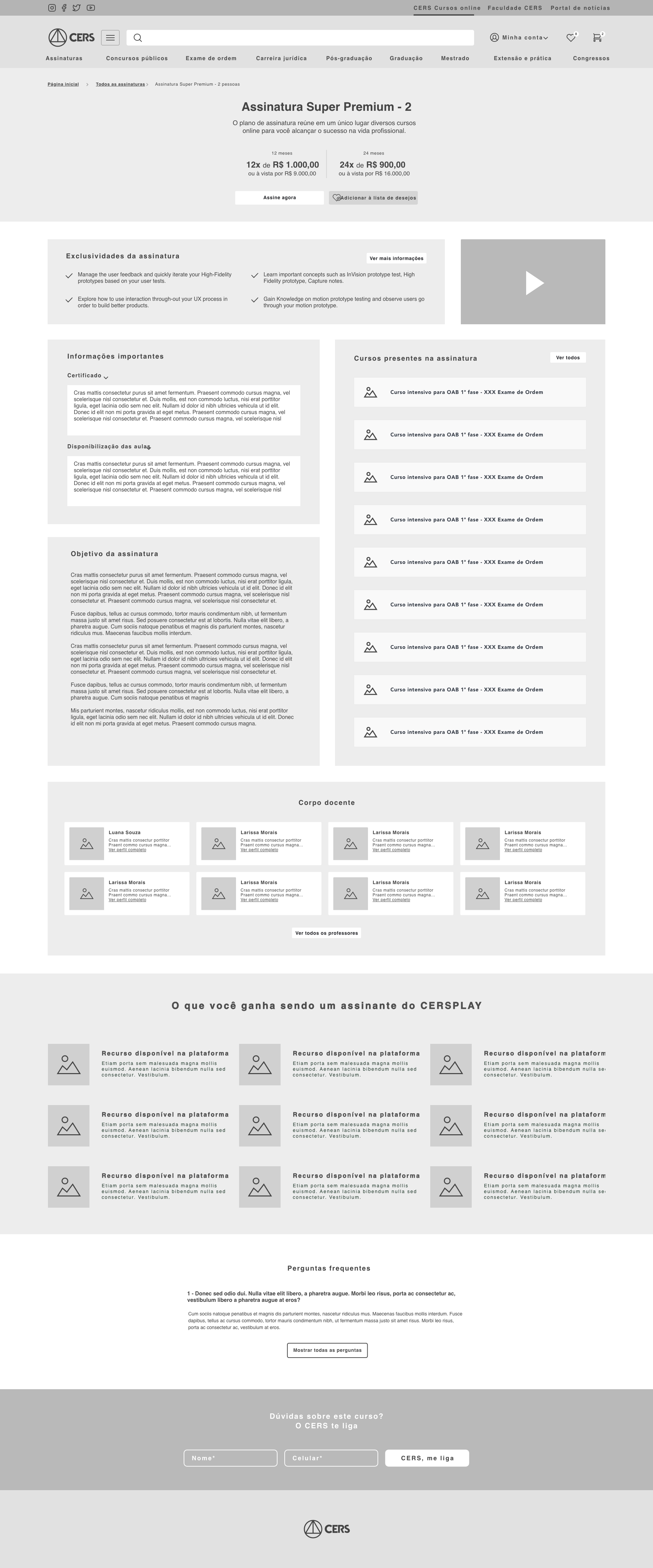
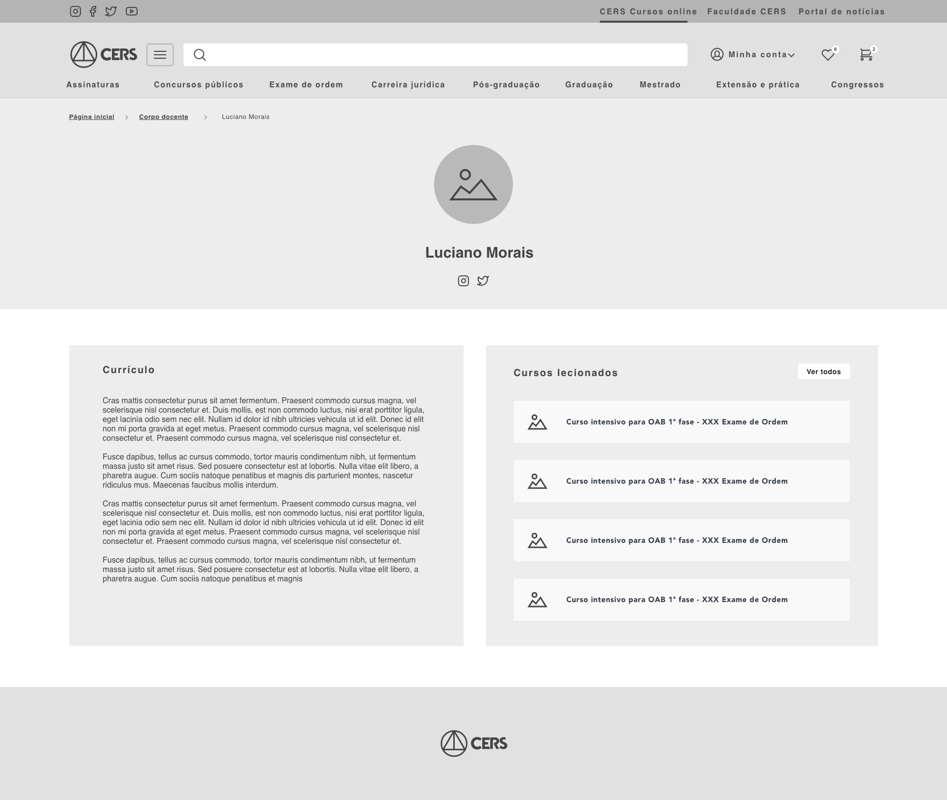
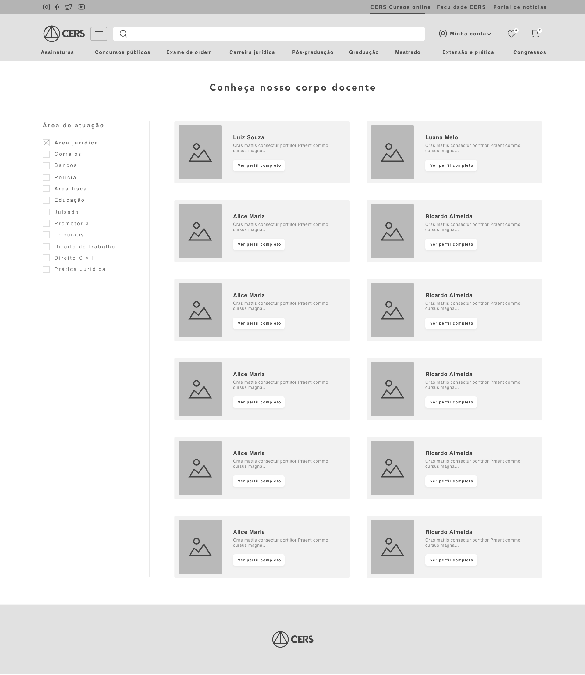
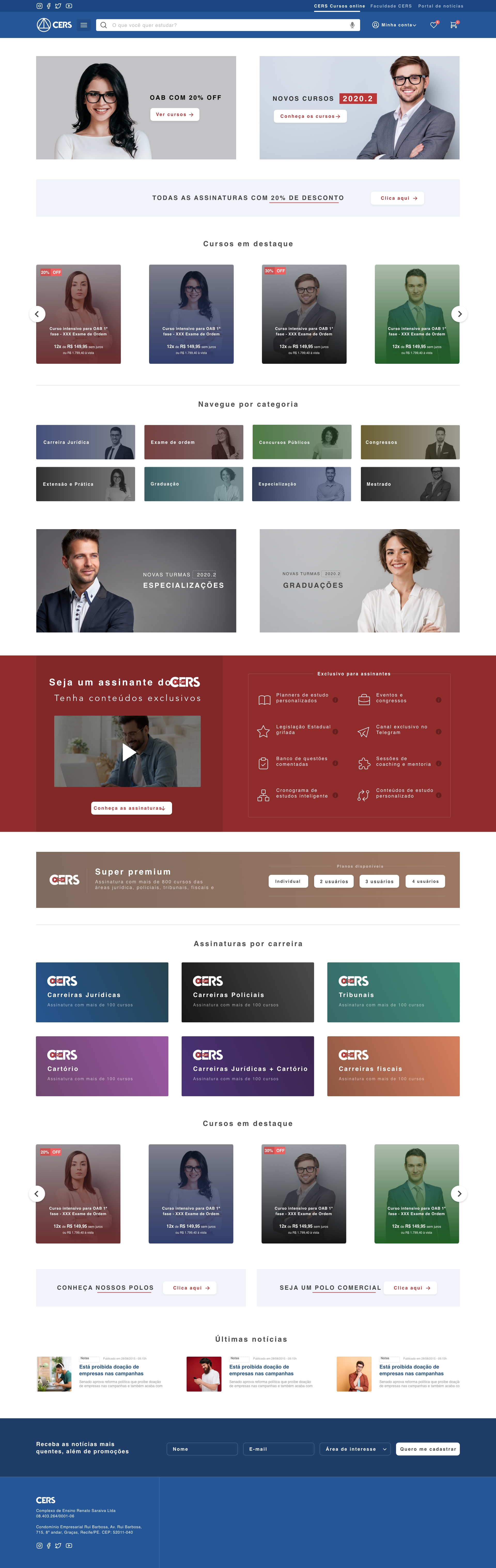
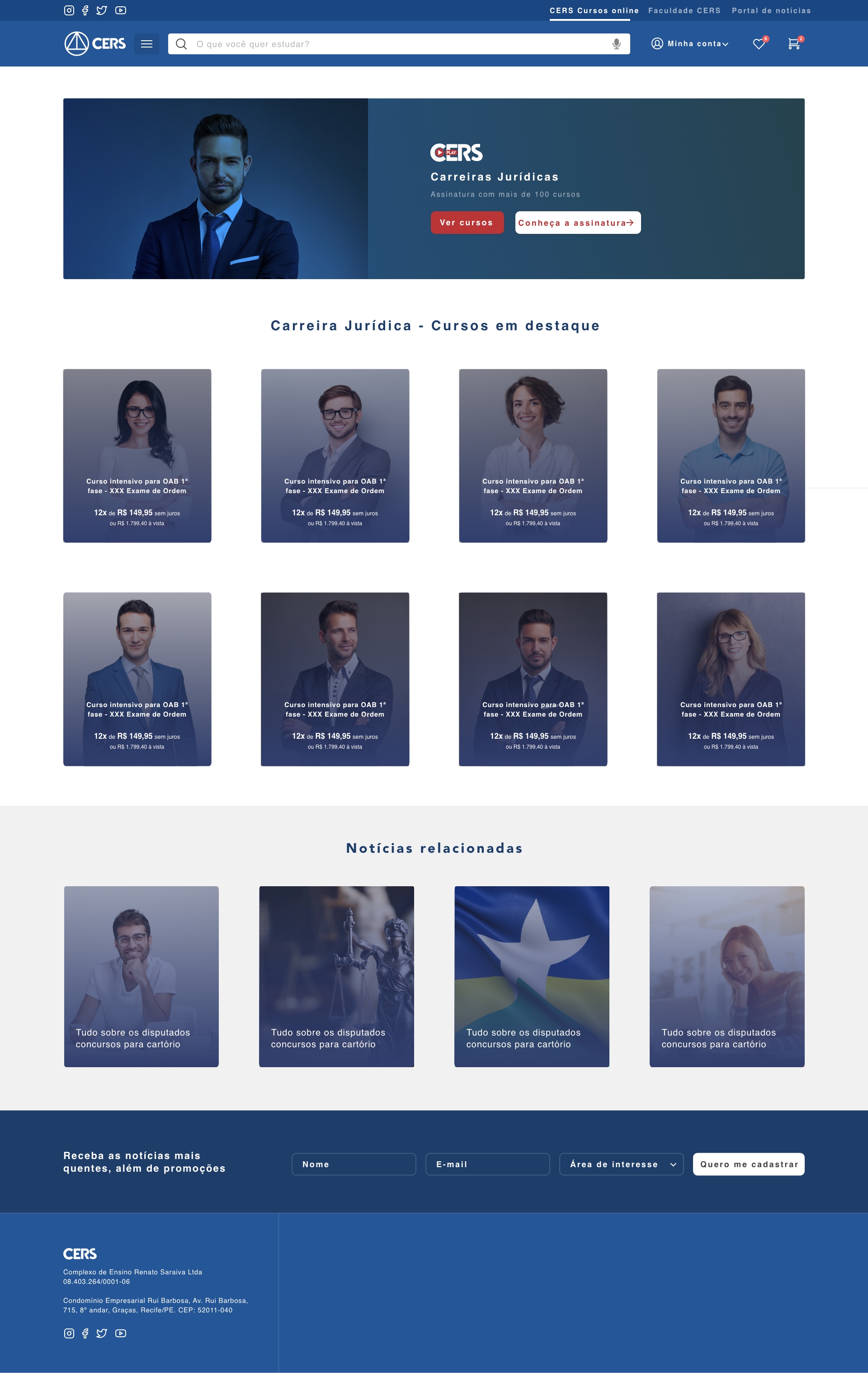
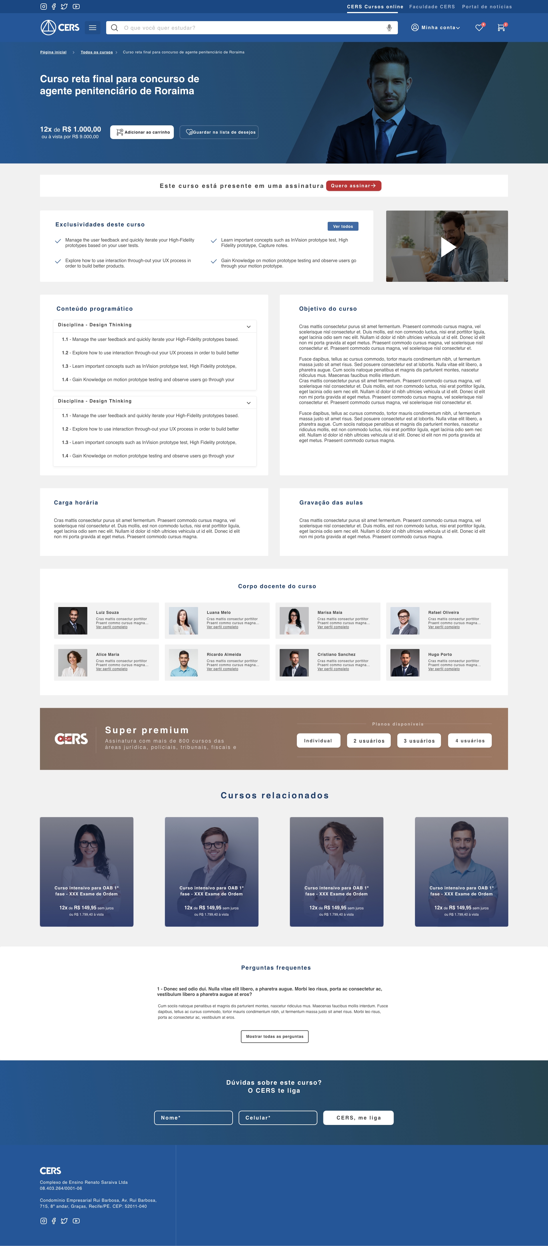
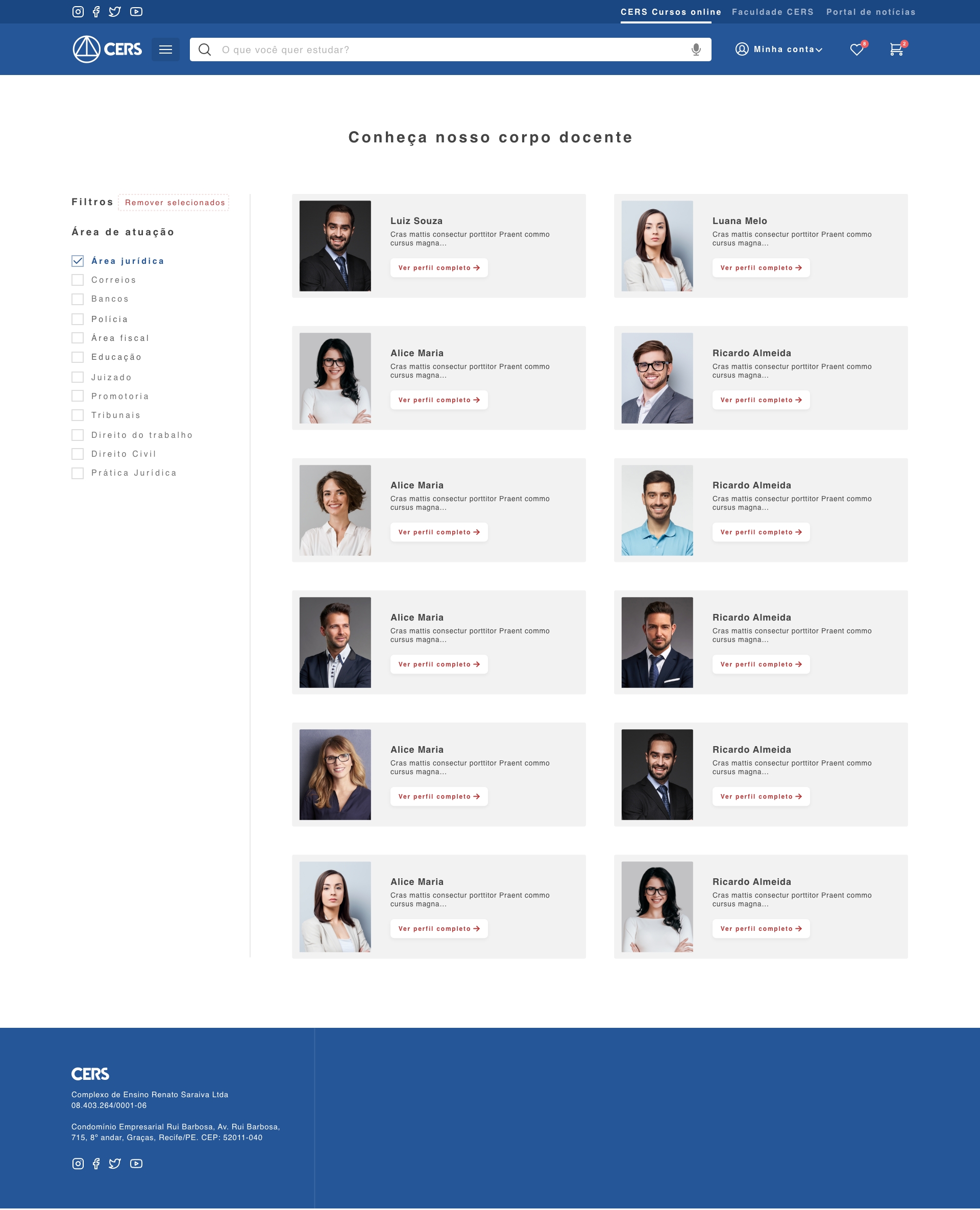
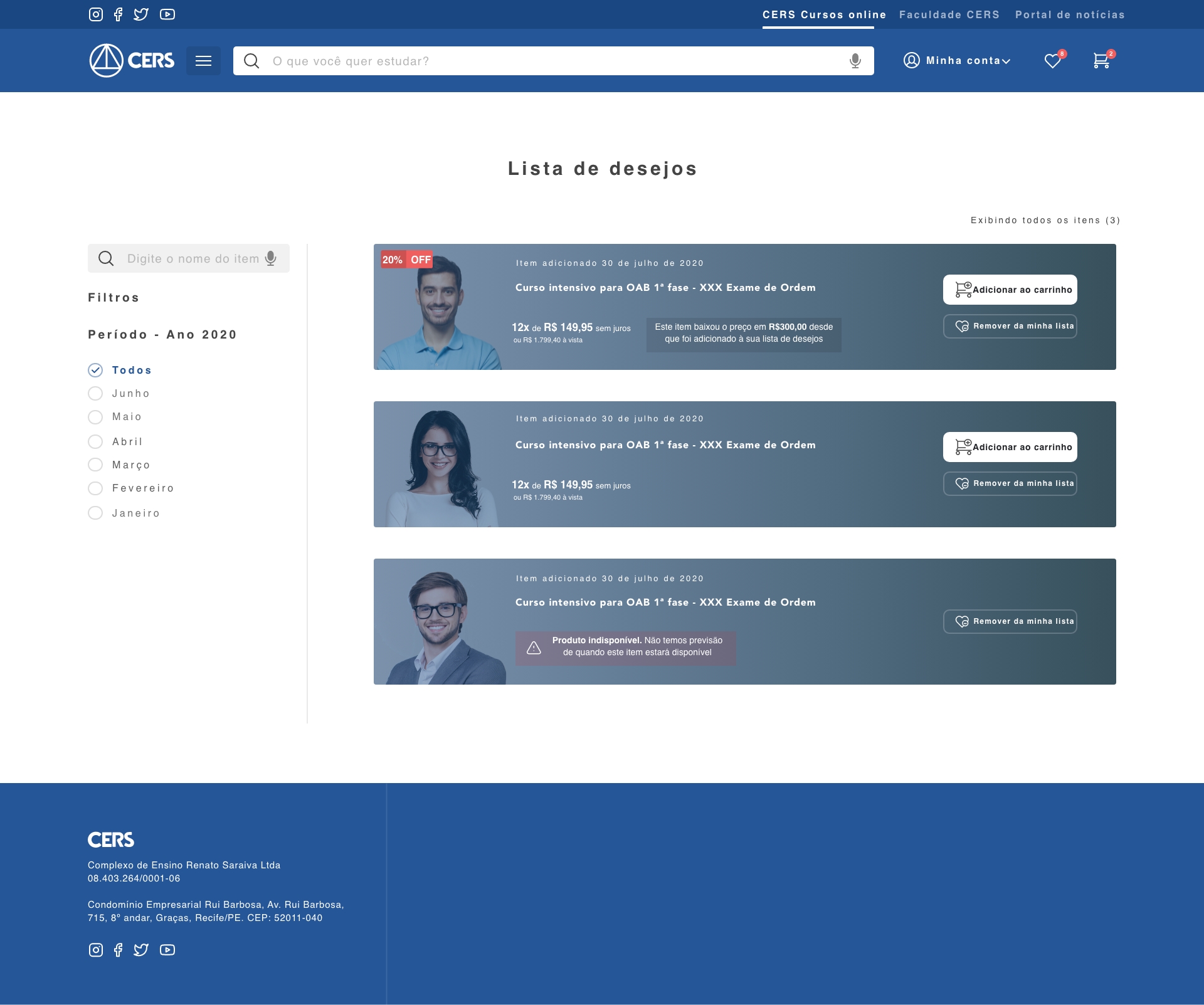
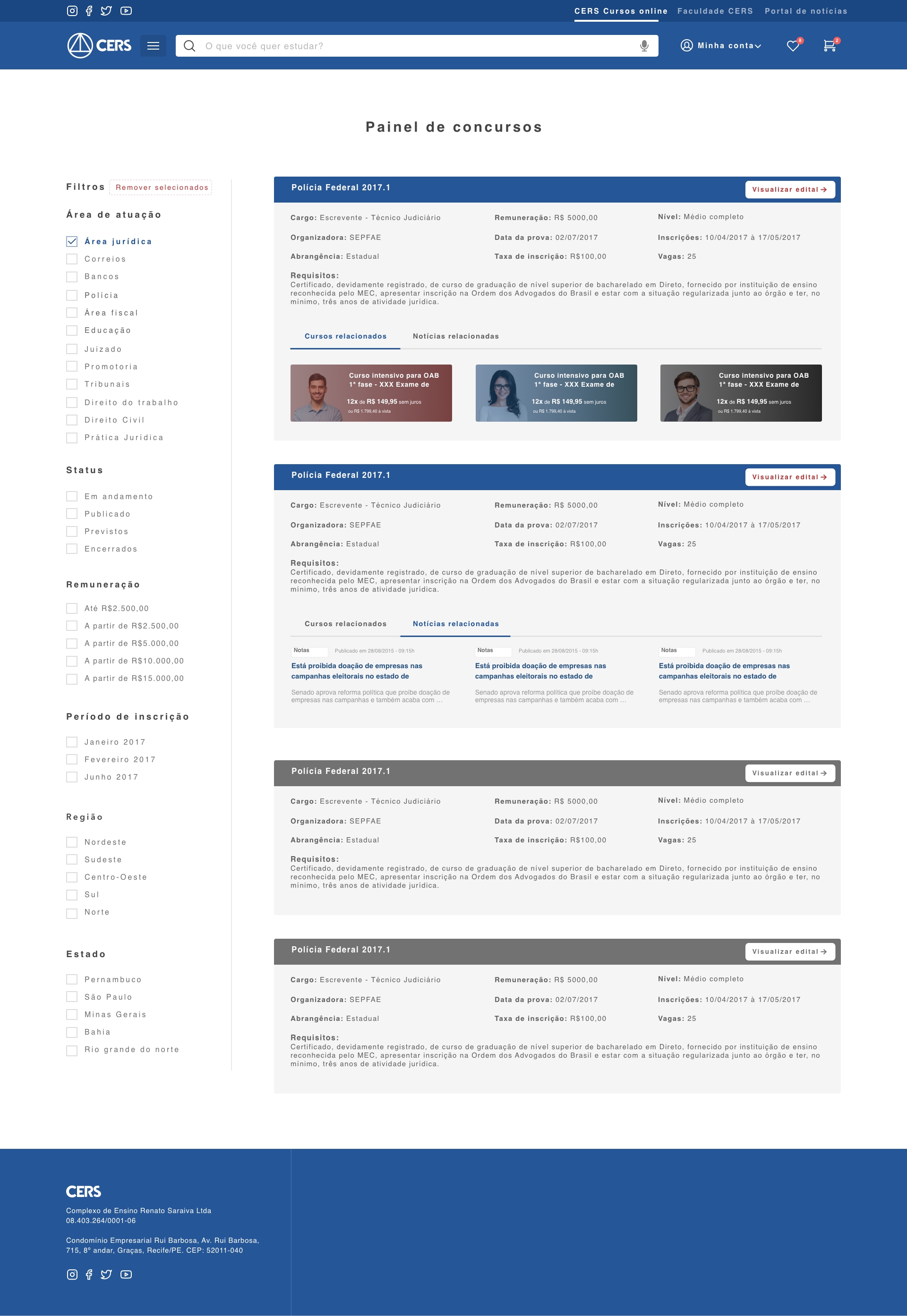
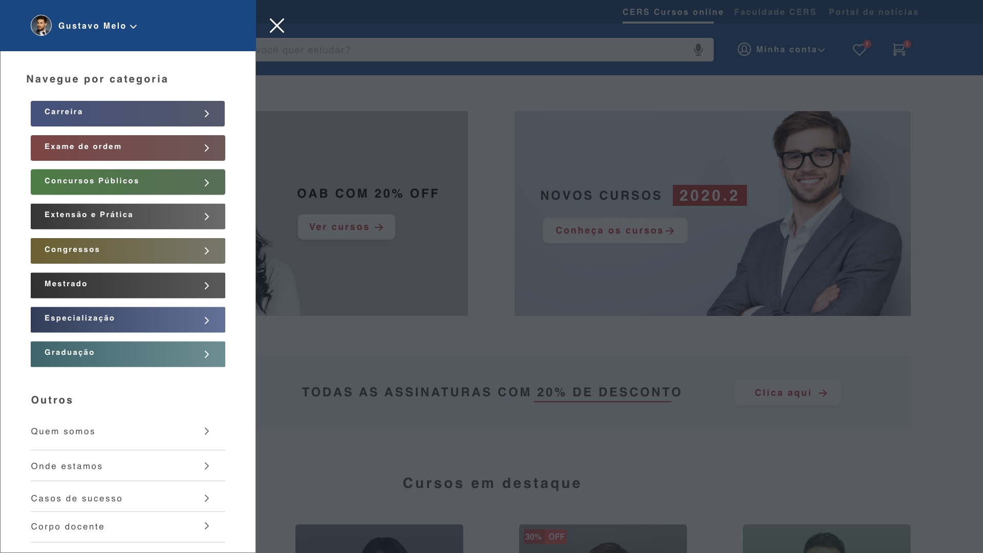
High fidelity prototype
Taking into account the design system and insights from usability tests, it was possible to structure the high fidelity prototype:
Mobile:


Desktop:
Conclusion and learnings
After the pandemic, it represented a turning point in CERS's digital operating model. In the midst of the pandemic, the consolidation of a robust e-commerce focused on distance legal education proved to be not only necessary but strategic.
The platform evolved from a product showcase to a complete educational ecosystem — bringing together online courses, recurring subscriptions, free materials, and digital legal events. The rapid digitization of the student experience revealed the importance of combining quality content with simple, fluid navigation focused on conversion.
User experience is key: more intuitive interfaces and simplified journeys increase engagement and reduce friction in the purchase process.
Subscription models are gaining strength: there was a significant increase in interest in continuous and flexible access to legal content.
Free content drives traffic and conversion: open materials serve as a gateway for new students and strengthen brand authority.
Online events expand reach: the digitization of congresses and workshops allowed the audience to scale and generate value at different points in the journey.
Integration between e-commerce and distance learning is essential: the smooth connection between the store, the learning platform, and the relationship channels improves retention and builds student loyalty.
The project reinforced that, more than selling courses, it is necessary to build a complete, personalized, and continuous educational experience. And technology, aligned with strategy, remains a central ally in this process.
Next project
Case study on structuring a learning platform in the legal and public exams field